
Archive / 2016
Pearson Literacy
A first-place college competition entry using custom typography to make adult literacy inequality visible in public space.
- Discipline
- Graphic design
- Focus
- Campaign typography
- Outcome
- First place
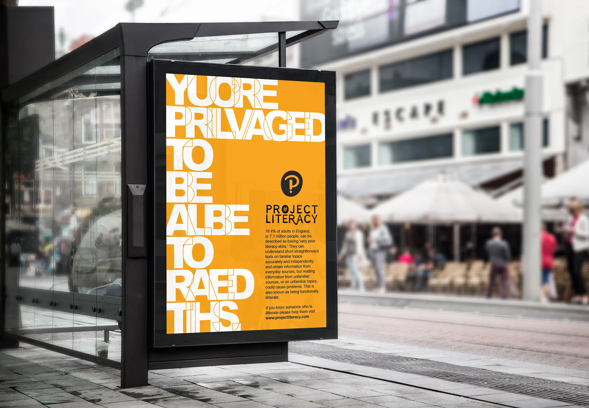
The idea
Make the reader feel the advantage of being able to read.
The campaign turns the act of reading the poster into its proof point. A direct statement confronts the audience first, then the supporting information connects that moment to adult literacy inequality.
From brief to poster
One issue. One format. One immediate thought.
The competition brief asked for a campaign around a pressing social issue. I focused on adult literacy and designed a single poster that could communicate at street distance while still rewarding a closer read.
The orange field creates visibility in a busy environment. Black carries the evidence and Project Literacy identity, while white gives the headline maximum contrast and scale.
of adults in England were described by the campaign source as having very poor literacy skills.
Campaign palette
Built to interrupt a grey street.
The system stays deliberately narrow: one signal colour, strong black and white contrast, and Pearson purple as the institutional anchor.
What made it work
The statistic becomes memorable because the reader experiences the message before being asked to understand the data.