
Archive / 2016
Burton Snowboard
A snowboard graphic exploration built around oversized custom lettering, layered colour and two contrasting deck treatments.
- Discipline
- Graphic design
- Focus
- Board graphics
- Year
- 2016
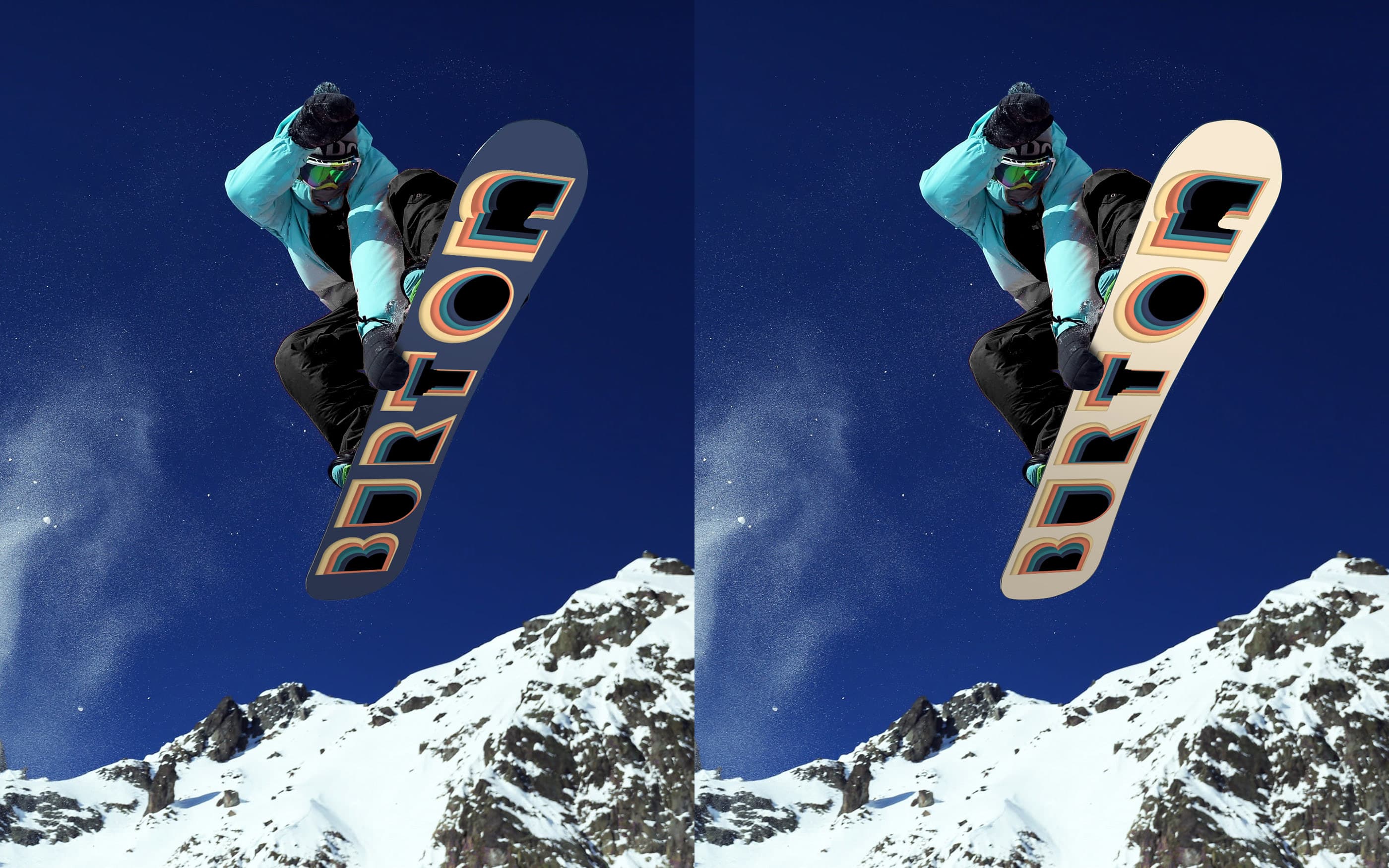
The idea
A board that reads as both image and word.
The Burton name is stretched vertically across the deck, so the letterforms become the composition rather than sitting on top of it. Offset layers of cream, peach, teal and navy create depth while keeping the silhouette readable from a distance.
Front / reverse
Expression on one side. Rhythm on the other.
The face carries the oversized lettering and layered colour. The reverse strips the system back to irregular bands, using the same palette to connect both sides without mirroring them.
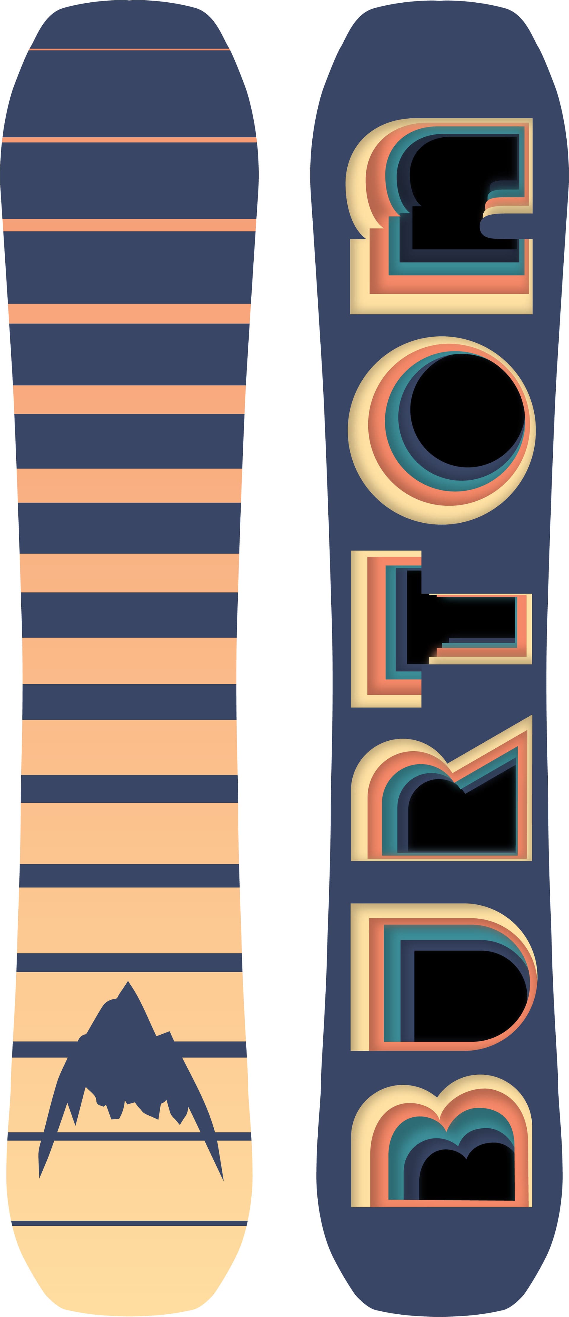
Colour system
Warm layers against a cold-weather base.
A muted navy anchors the board while warm cream and peach layers give the lettering energy. Teal creates the sharpest contrast, with black used as the visual core of each form.
What holds it together
One strong typographic move carries the whole board. Scale makes it immediate, while repetition and colour give it enough detail to reward a closer look.